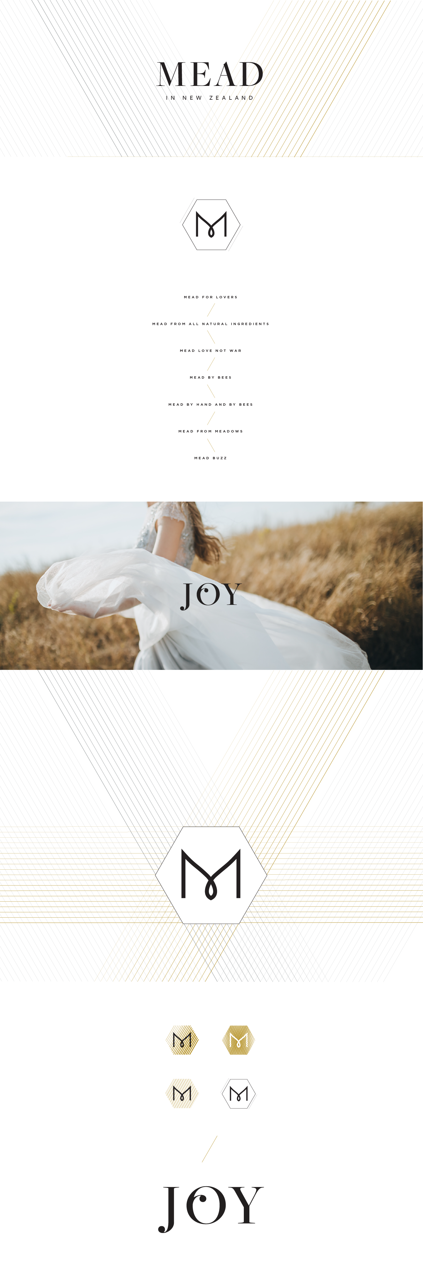
BRAND IDENTITY & LABEL DESIGN — MEAD IN NEW ZEALAND
Mead in New Zealand launched with a clear brief: to bring honey wine into the modern age—drawing on centuries of tradition while appealing to a new generation of drinkers.
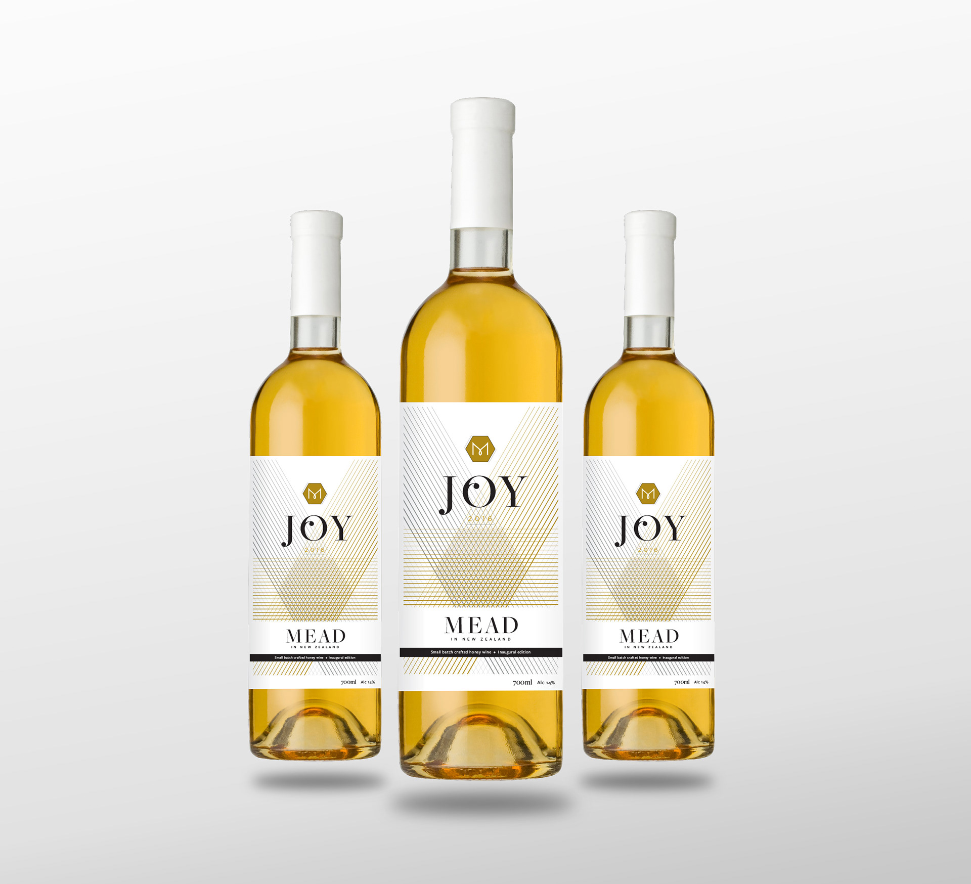
The inaugural product, Joy, was positioned as a celebration in a bottle. The visual identity paired silver and gold foil—echoing the shimmer of bees’ wings and the richness of honey—with refined type and minimal ornamentation. Innovative printing techniques were used to produce a label with incredibly fine detail. The result was a label elegant enough for a wedding table, yet bold enough to catch the eye of modern millennial consumers.
Rooted in love and legacy, the brand was designed to feel both timeless and entirely new.